Rover …a redesign
Rover is a an app connecting pet owners with trusted local sitters… with room for improvement.
INTRO

role
UX/UI Designer Researcher
category
UI/UX Design
year
2023
timeframe
4 weeks
Background

PS - This is a case study, I am no way affiliated with Rover.
Problem
Too Much Effort, Too Little Clarity

Solution
Let the Right Sitters Come to You
Otis posts a single job card. Available sitters nearby get notified. Only those who want the job reply, so Otis is able to choose from a list of confirmed, interested sitters he likes!


tools
• Figma
• FigJam
• After Effects
deliverables
• User Research
• New Site Map
• New Info Architecture
• Hi-Fi Wireframes
RESEARCH
Competitive Analysis


Secondary Research
Analyzing reviews from Trustpilot and the App Store revealed consistent pain points in Rover’s experience. These unfiltered user voices surfaced key frustrations that aligned closely with our interview findings.


Key insights:

Pet owners described the booking process as high-effort, low-reward, investing time upfront, but often received little or no response.
Sitters lack accountability, frequently ignoring messages without consequence, leaving owners feeling ghosted.
The booking flow itself was the most cited pain point, pointing to it as the root of their negative experiences.
User Interviews
What I learned from talking to real users…
Interviews with pet owners and sitters, I confirmed the key frustrations in Rover’s booking experience. Owners felt overwhelmed by having to message multiple sitters with little response, they're trying to balance convenience with trust.
Sitters were flooded with irrelevant requests and didn't feel it was necessary to get back to pet owners.
Both sides described the process as confusing, effort-heavy, and lacking assurance.


For Otis, this meant long waits by the door, canceled playdates, and owners stressed out instead of enjoying their trips.


The Solution (my "ah-ha" moment)
Instead of cold messaging sitters and hoping for replies, Otis creates a single Job Card. Nearby, sitters are instantly notified, and only those who want the job need to accept. This provides a list of confirmed sitters Otis can book or message for a meet and greet.


INFO ARCHITECTURE
Task Flow
Rover’s existing booking flow forces pet owners to individually contact sitters and wait for replies, often with no response. This creates stress, wasted time, and uncertainty.
In the new flow, owners create a single Job Card, which is automatically sent to nearby sitters. Only interested sitters respond, giving owners a confirmed list to choose from quickly — no more cold messaging or ghosting.


DESIGN
Wireframes
The following wireframes show the development of the booking process from the Client's perspective of creating a Job Card, and contact with the Pet Sitter. It also shows screens of the Pet Sitter receiving a notification and reviewing the Job.
Client creates a Job Card for a Home Sit


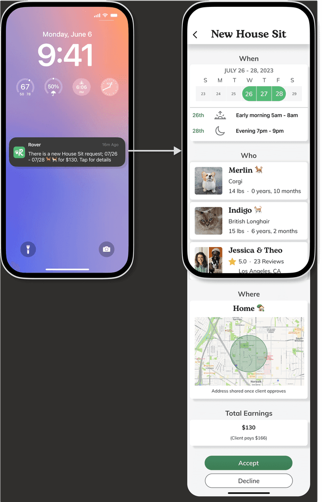
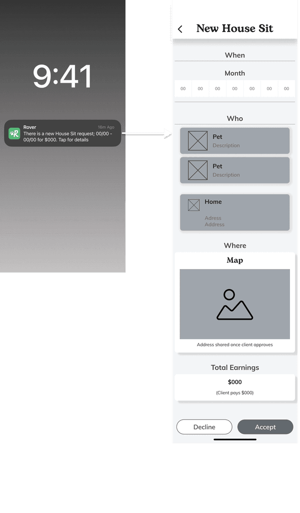
Pet Sitter receives an alert and views the Job Card


DESIGN ITERATION
Usability Insight
5 participants
Ages 27- 50
3 tasks - create a Job Card as a Pet Owner, review Job Card as a Sitter, then message Sitter
Testing revealed a few insights for the of the design. Users found the process easy to use and needed a few minor changes to make the instructions a little clearer.

Improving the Home screen
Depending if the user a pet sitter or pet owner, Rover's current design has two Home pages. Research showed that most pet sitters also use Rover to as a client, and vise versa. Instead of having two Home screens the user is given a CTA.
Adding a simple carousel of relevant topics creates a sense of community.


Improving the Sitter's Experience
Rover's current systems pings Pet Sitters with an auto-populated message sent by the client with details about the job. Unfortunately this message is disorganized and does not display the information clearly. A lot of the information is repeated in different areas, with no consistency between them.
The way in which information is presented can make all the difference. Using a Job Card format with the essential details laid out in a clear visual cues using the 4 of the 5Ws (who, what, where, and when) generating an effective hierarchy.
Original

New
PROTOTYPE
Take a look at the Figma prototype in action!
Looking back
Lessons
The time spent scouring through reviews for secondary research was well spent. These findings were critical in pinpointing the right problem to solve for the largest user gain.
Also, without the aid of those close to me who participated in testing, research, (and encouragement) I wouldn't have been able to make this project happen, I am forever in their debt.
Next Steps
I would like to pass these findings and solutions off to the team at Rover and hopefully they can implement some of my findings into their app.


